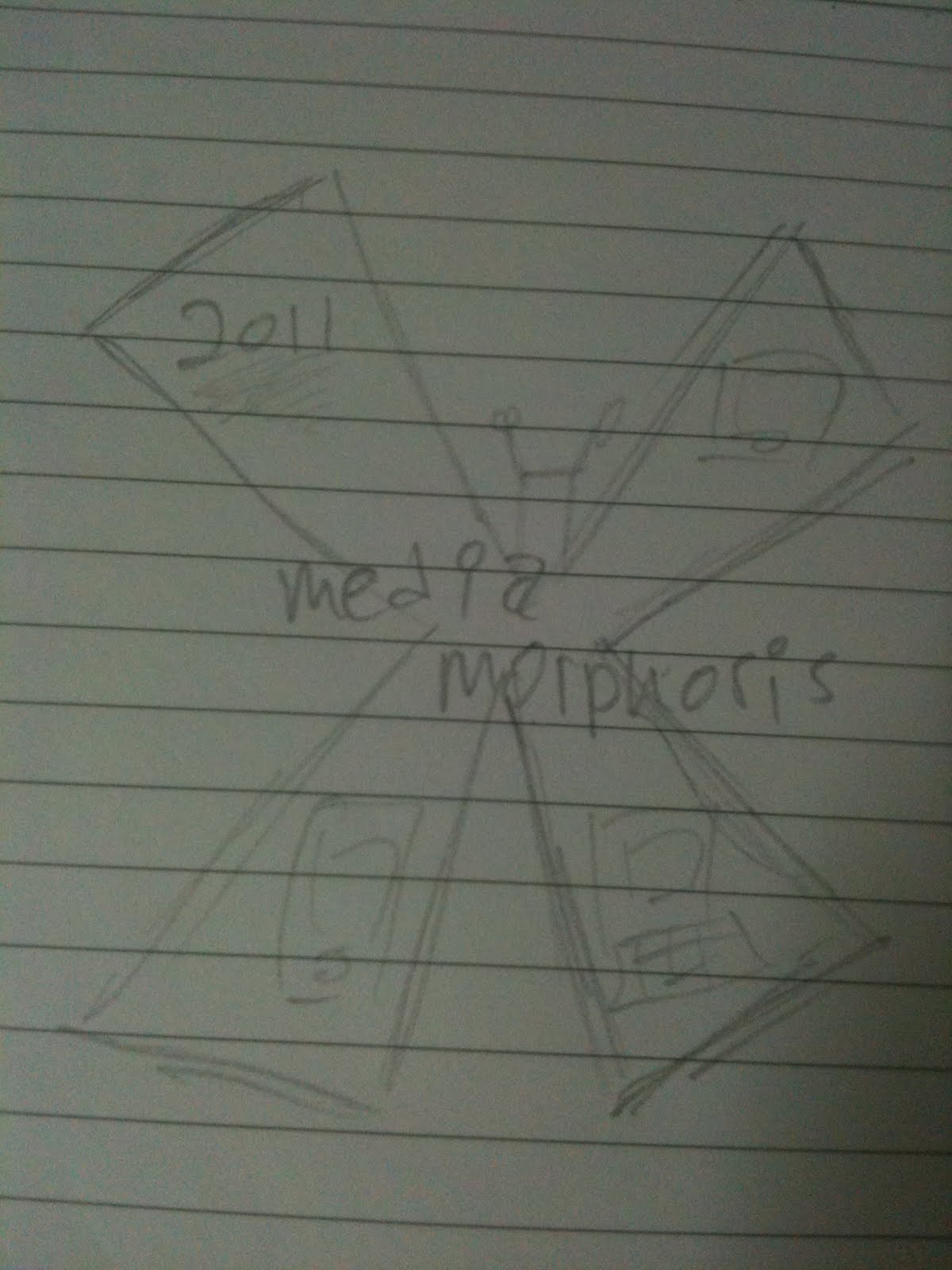
For CA2, I came up a whole lot of ideas I really wanted to try out! We were instructed to create a logo and a poster for the theme of "MediaMorphosis", which was our Media Conference event
chosen for next year. It was a play of words, that involves "Media" and "Metamorphosis".
Genius, I'd say. Anyway, here was my preparation.
Logo
I first began creating a logo that had a more serious look to it. I wanted it to look class and business-man-like. It had to have sans serif fonts and a certain touch of world issues.
I needed the make a large and over-bearing "M" as the basis for this logo. (Since both Media and Morphosis starts with the word M) This M shows a dominating and authoritative feel that can express seriousness.

Through emphasizing this M, I could created the logos:
Stretched Rectangular

Shadowed M

Electrical Charge M

Computer Language Transformation M

Shadowed M 2

I actually chose "Computer Language Transformation M" as my logo at first. The idea of this concept is that: Newspaper text will be featured behind the logo. As the text intersects with the "M", it turns into cyber language (1010101010 etc.). I really adored this idea at first. I was ambitious and turned concept into reality as I created it.
However, I begin to realize how serious the concept is, and how more important it should be for a logo to be "fun" and "original".
So I embarked on a quest to change it!
To incorporate a fun and learning-friendly theme for my logo, I had to create my own font. Why? Well, I didn't wanted to put a generic image across. I wanted my logo to be seen as being original and created, and that no two alphabets are the same; just as how the media industry should be: creative and unique.

I added in shapes to create somewhat an abstract image for my logos. These shapes would magnify or modify whatever text was in contact with the shape, creating a somewhat "metamorphosized" version
Here were some of my creations:
Triangles

Circles

Squares

Rectangles

Blobs
I REALLY loved the abstract look. But something about it was way to simple. I needed to look deeper into the idea of metamorphosis. Not to be cliche and predictable, but the most common knowledge of metamorphosis is akin to the growth of a caterpillar to a butterfly.
To maximize understanding, a butterfly would there be the best fit for the common man to relate with.

An actual butterfly picture would be difficult to recreate and could be difficult on the eyes. Therefore, I preferred to create silhouettes of a butterfly, of course in different shapes and sizes.
Here were some ideas:
Exact Silhouette

Curved Silhouette

Sharp Silhouette

Silhouette created from cubes

Silhouette created from texts
Then again, a the butterfly is too simple. It doesn't tell enough about the event. What the event is really about, is the evolution of media and how it has transformed from normal print and traditional media to technological and interactive media such as television and MOST IMPORTANTLY OF ALL: THE INTERNET.
So how do I express this?
Simply put it: placing pictures of advanced medium such as the iPhone or a flat screen television would send across this message.
However, the current curvy and fun font would not work well with pictures of gadgets and etc. So I chose to change it to something more "sharp" and "serious".
There it is. Sharp "sans serif" fonts that should work well with masculine gadgets.
I needed to have references for these pictures. So I took pictures of these:
Pretty nifty, right? Yes that is my 50 inch television! Aaannndd what looks like Dr.Dre and Eminem on MTV.
Anyway, here are some simple logos out of these gadgets:
Flat Screen TV
Newspaper Whirlwind out of iPhone
After all these, I thought to myself: Why not combine everything?! Brilliant! All the elements in one logo, both beautiful and meaningful.
Here were the ideas:
Sharp Butterfly
 Tv Emphasis with Butterfly Deco
 Curved Butterfly with Minor TV Emphasis
 Curved but Squarish Butterfly
 Elegant

The 5 logos represented a butterfly silhouette and advanced mediums as either lower emphasized or greater emphasized. The font used was the same as the ones used in the "Shape Logos".
I decided to use the last one because of its simplicity, fun and elegant look that will appeal to people of many age groups.
Poster
It is ensured that all of my posters contain proper proportions and balance.
1.

This poster featured a staircase that showcases the evolution of media. It begins with the introduction of television, and so on and so forth.
2.
This poster featured a hand that is progressively drawing a caterpillar onto a blank white canvas. It is shown that through the media, the person has the power to 1. Create, 2. Educate, 3. Inform, 4. Empower and finally 5. to Change.
The idea of change coincides with the theme of "Mediamorphosis" and is then, accompanied by a butterfly (which shows the power of the pencil the hand is holding) that metamorphosised from the caterpillar.
I chose this poster as my final poster because it strikes the most meaning.
3.

This poster shows the planet earth, accompanied by a rainbow which is carrying various advanced media tools such as television. It shows how technology is entering planet earth.
Mascot
I actually planned on implanting a mascot for my logo/posters but were not able to do so because of its complicated outlook and the way it would take the meaning off my posters. I did, however, took the effort to create him to properly visualize and try it out.
Ladies and gents, meet Mr. Media

Sorry Mr. Media but whilst you laugh away at an unknown object, I'm going to have to tell you that you didn't make the cut. But an honorable mention, I must say.
Finally, the time you've been waiting for.
Final Work
Poster

Logo

The final logo does have a little change from the sketch. Firstly, the text is bigger and secondly, the Media Morphosis words are backed by a 3D design that featured a technologically decorated blue shadow which showed somewhat an evolutionary step from the black fonts to the cool looking blue fonts.
Thanks so much for reading! :)


 I never knew of Car Shoe until today. Personally, I have a problem getting fond of its name, but that's not my problem. The logo features a tire, but it properly balances the rectangle that the text and tire is contained in. Though one would perceive a car tire anywhere to be quite messed up, this logo nicely shows it.


