Ngee Ann Polytechnic's Open House!
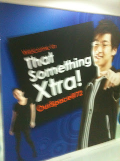
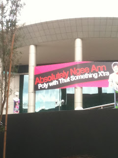
We were instructed to find the different designs of NP. Here were the ones we found interesting enough to be comment on. However, not all of them were nice.

Their open-house website was pretty messy. It looks very feminine, however. Therefore, this must be more catered to girls.

A guideline for open-house visitors. Very wordy.

Their models for this print ad had a nice calm and cool attitude.

I liked their text placing. It could be annoying to read at text that goes an awkward direction, but I find it rather artsy.

I love the grafitti on these pop-ups. Very nicely contrasting with the pink.

Again, as above, another attempt and feminizing their art direction to cater to females.

There were nice designs. Using students to attract students is something that is relatable to them. Additionally, the nice colour difference to represent each course is attractive.

Again with the awkwardly positioned text. This one's even better because its shorter.

A funky logo of their CCA Fiesta event. This would cater to trendy kids.

This one's not good because its dark and its placed in a room that's dark. The colours should be brighter.

Ngee Ann's FMS logo is really nice. It's a simple square but again, their use of the text that goes diagonally upwards. Very attractive. However, their use of Xplore Xcite and Xcel doesn't relate to anything. What's with the X?

No comments:
Post a Comment
Note: Only a member of this blog may post a comment.