

Wednesday, January 19, 2011
Thursday, January 13, 2011
Group 2: Ngee Ann Polytechnic's Open House
Ngee Ann Polytechnic's Open House!
We were instructed to find the different designs of NP. Here were the ones we found interesting enough to be comment on. However, not all of them were nice.

Their open-house website was pretty messy. It looks very feminine, however. Therefore, this must be more catered to girls.

A guideline for open-house visitors. Very wordy.

Their models for this print ad had a nice calm and cool attitude.

I liked their text placing. It could be annoying to read at text that goes an awkward direction, but I find it rather artsy.

I love the grafitti on these pop-ups. Very nicely contrasting with the pink.

Again, as above, another attempt and feminizing their art direction to cater to females.

There were nice designs. Using students to attract students is something that is relatable to them. Additionally, the nice colour difference to represent each course is attractive.

Again with the awkwardly positioned text. This one's even better because its shorter.

A funky logo of their CCA Fiesta event. This would cater to trendy kids.

This one's not good because its dark and its placed in a room that's dark. The colours should be brighter.

Ngee Ann's FMS logo is really nice. It's a simple square but again, their use of the text that goes diagonally upwards. Very attractive. However, their use of Xplore Xcite and Xcel doesn't relate to anything. What's with the X?
Wednesday, January 12, 2011
Typography Exercise
Kerning


Grid


However, the movie poster for STONE was really bad. The kerning was so extremely packed that I could barely make it out.
Monday, January 10, 2011
Good Logos and Bad Logos in ORCHARD ROAD!
Logos again. This time, in the heart of Singapore - the bustling roads of Orchard, and its vast array of shopping malls that house some of the world's most recognized brands.
Logos make the brands. Let's go through what I found.
Good Logos
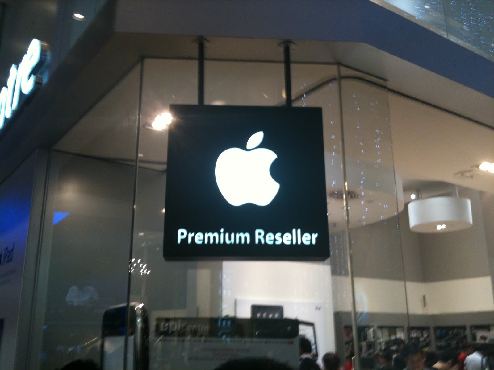 The Apple Logo - Simple, though not informative. It has created for itself, a benchmark of high-end products. What makes this logo stand out is the clarity of its silhouette - an apple. You can't doubt, deny or ponder on it. It is an apple. A bites been taken out, but hey, that makes for good design too.
The famous watchmakers from Switzerland. Victorinox has no trouble in putting forth their origins in their logo. An aptly designed swiss flag is imprinted onto a crest that isn't too sharp or curved. Very savvy.
 I never knew of Car Shoe until today. Personally, I have a problem getting fond of its name, but that's not my problem. The logo features a tire, but it properly balances the rectangle that the text and tire is contained in. Though one would perceive a car tire anywhere to be quite messed up, this logo nicely shows it.
 Cartier makes no mistake in portraying elegance. It's design is simple, but the curves and serifs and very well drawn out. Every end and every sharpness is palpable.

I never knew of Car Shoe until today. Personally, I have a problem getting fond of its name, but that's not my problem. The logo features a tire, but it properly balances the rectangle that the text and tire is contained in. Though one would perceive a car tire anywhere to be quite messed up, this logo nicely shows it. Cartier makes no mistake in portraying elegance. It's design is simple, but the curves and serifs and very well drawn out. Every end and every sharpness is palpable.
ION Orchard is Orchard Road's latest installment to its row of shopping centers. The logo features a somewhat "alien" font for its ION word. That isn't the great thing about it though. There is great balance in it. The words "Orchard" is well fitted into the length of the word "ION", making it look nicely compacted and easily absorbed by viewers.
 Giordano has a logo that presents itself clear and simple. The words are nicely spaced out. Although its a little bit lengthy, it's pretty short in height. Very compact; easy to remember.
 The Nike logo. Need I say more? Brilliantly crafted and represents perfection.
 Y.3 has a wonderful choice of colors. Red is seen as aggressive and it stands out, while the other wordings are in white. It's good contrast and people will see the Y.3 wordings very well.
Burger King has a very cartoonish look to it. It's round, nicely compact and the design looks professionally done. However, it's not very well balanced and not quite easy to remember because of the horrible choice of colours.
Bad Logos
 Mango has a logo that looks way too militarized. It's too serious! A logo should never be that intimidating.
 House of Condom's sex toy franchise does great justice to its logo - its unknown to most people. It's going to stay that way if it continues to use this logo, with its horrible three-color choice that features the main colors of the spectrum. Also, very militarized look that's similar to Mango's. Now THAT scares me away.
 DSQUARE's logo is so compacted and confusing that the first time you read it, you'd go "dsaurersqur"?
 Prada's an international brand that's too prestigious for its logo. Sure, it looks classy, but simplicity at its best is too simple for its own good.
 Yves Saint-Lauren has a logo people would look at, ponder to his/herself as to why a piece of children's art is hanging on the wall, and then look away. Their products are lovely, but the logo is too compact. WAAAAY too compact.
 OPSM Optical. I don't even know this store, but its logo would explain why. Using red is always a good thing when theres something to match. A black word that's unbalanced and sitting right next to it isn't something to match.
 Everybody loves Macdonald's. Its logo is established. That we cannot deny. Its logo is pretty ugly. That we might argue. McCafe's yellow and brown logo that has the same color as garbage and excretion? That i'd rather not think about.
 Watsons looks like it's trying to be in the year 2090. Not yet, Watsons.
 I know the picture quality isn't that good, but Shiroz - or Shirog - had a logo that was very hard to decipher. The font was pretty cool and all but you gotta admit: being a streetside stall that sells kebabs kinda needs a logo that doesn't look like its trying to market clothings.
Subscribe to:
Posts (Atom)